-
Planning and Design
- Requirement 01 Risk management plan for AI system and execution of the plan
-
Requirement 02 Organization of an AI governance system
- 02-1 Have you established guidelines and policies on AI governance?
- 02-2 Have you formed an AI governance group and reviewed the composition of the group?
- 02-3 Is the AI governance being supervised to ensure proper implementation?
- 02-4 Has the AI governance group reviewed the differences between the new and previous systems?
- Requirement 03 Development of a plan to test trustworthiness in the AI system
-
Data Collection and Processing
-
Requirement 04 Provision of detailed information for data utilization
-
04-1 Is there detailed information to support the accurate comprehension and utilization of data?
- 04-1a Have you explained the data attributes before and after cleansing?
- 04-1b Have you sorted data into training data and metadata and is there a specification document for each of them?
- 04-1c Have you explained the reason for selecting the protected attributes and whether they were reflected?
- 04-1d Were data labelers trained and have you provided them with work instructions?
- 04-2 Is data provenance documented and managed?
-
04-1 Is there detailed information to support the accurate comprehension and utilization of data?
- Requirement 05 Inspection of abnormal data to ensure data robustness
-
Requirement 06 Removal of bias in the collected and processed training data
- 06-1 Have you prepared measures to mitigate bias due to human and physical elements in data collection?
- 06-2 Have you analyzed features used in training and prepared selection criteria?
- 06-3 Have you checked and prevented potential biases in data labeling?
- 06-4 Have you conducted sampling to prevent bias in data?
-
Requirement 04 Provision of detailed information for data utilization
-
AI Model Development
- Requirement 07 Ensuring security and compatibility of the open-source library
- Requirement 08 Removal of bias in the AI model
- Requirement 09 Establishment of defensive measures for AI model attacks
-
Requirement 10 Explanation of AI model specifications and the inference results
- 10-1 Do you provide evidence for users to accept the generation process of the model’s inference results?
- 10-2 Have you transparently provided the specification of the model on the AI model specification document?
- 10-3 When needed, do you provide an explanation about the inference results of the AI model?
-
System Development
- Requirement 11 Removal of potential bias in the implementation of the AI system
-
Requirement 12 Safe mode of AI system and establishment of a process for notification of problems
-
12-1 Have you implemented a safe mode that can respond to problems such as attacks, low performance, and social issues?
- 12-1a Have you prepared an exception handling policy for such problems?
- 12-1b Have you implemented a security technique to reinforce the security of the AI system?
- 12-1c Have you considered a decision-making method that includes humans to mitigate the uncertainty of the AI system?
- 12-1d Are guidance and action on handling expected user error provided?
- 12-2 Does the system perform the function of alerting the operator if a problem occurs in the AI system?
-
12-1 Have you implemented a safe mode that can respond to problems such as attacks, low performance, and social issues?
-
Requirement 13 Improvement of users’ comprehension of the explanation of the AI system
- 13-1 Have you analyzed user characteristics and constraints in the AI system?
-
13-2 Have you provided a thorough explanation based on user characteristics?
- 13-2a Have you established criteria for the evaluation of explanation according to user characteristics?
- 13-2b Have you used terms that are appropriate to user characteristics?
- 13-2c Have you used accurate expressions to lead users to specific behaviors and comprehension?
- 13-2d Are the location and timing where an explanation is needed appropriate?
- 13-2e Have you utilized various user survey techniques to evaluate user experience?
-
Operation and Monitoring
-
Requirement 14 Ensuring traceability and modification history of the AI system
- 14-1 Have you established measures to track the AI system’s decision-making?
-
14-2 Have you obtained the modification history of training data and managed the impact of data modifications?
- 14-2a Have you prepared measures to track the data flow and lineage?
- 14-2b Have you developed measures to monitor modifications in the data source?
- 14-2c Have you managed the versions during data change?
- 14-2d Do you provide information to stakeholders when data change?
- 14-2e When new data have been collected, do you reevaluate the performance of the AI model?
- Requirement 15 Explanation about the scope of services provided and the subject of interactions
-
Requirement 14 Ensuring traceability and modification history of the AI system
-
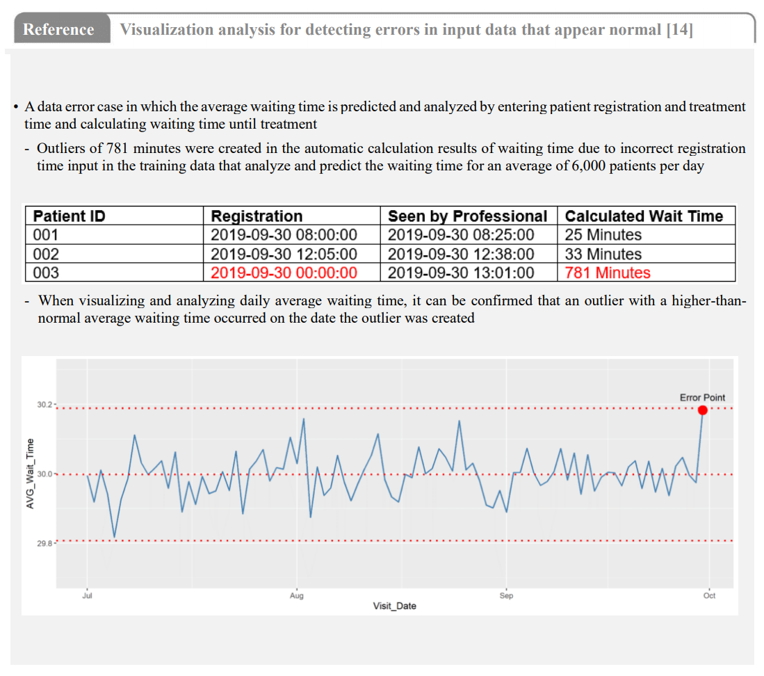
05-1aHave you checked any possible errors by visualizing the overall training data distribution?• You can find additional input errors by visualizing all data distribution after data cleansing, one of the data pre-processing processes. Data manually inputted by nurses and specialists, such as patient medical records, do not contain data omissions such as null or N/A; however, human errors such as incorrect entries can cause outliers, which can be verified by visualization of data distribution.
• In small datasets, outliers and errors can easily be identified and managed, but when utilizing and managing large quantities of data, such as over one million patient medical records, visualization enables easy identification of errors that may occur due to human error. Visualizing data distribution can also be helpful in exploring and understanding data for AI model training.
• There are different techniques for visualizing data distribution depending on data attributes. These techniques are distribution charts that visualize data distribution using mean, variance, and deviation of the entire data; categorical charts that visualize categorical data; and matrix charts that visualize data in a 2D array.